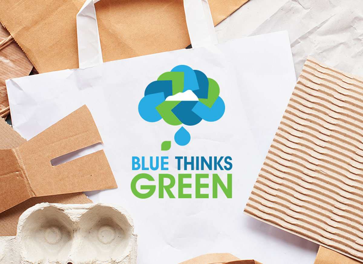
Blue Thinks Green has been a Blue Mountain brand for many years with a focus on all areas of the Resorts environmental efforts. While working for Blue Mountain we needed to refresh the logo to bring it to the modern age.
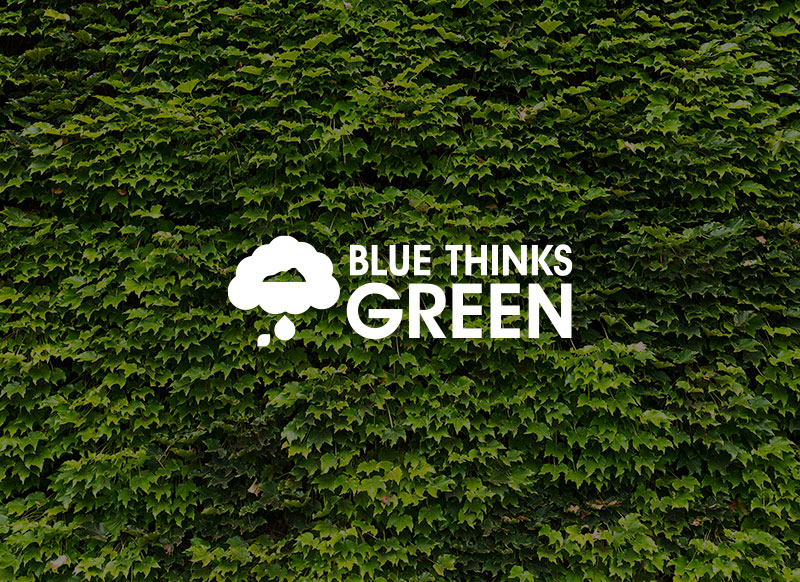
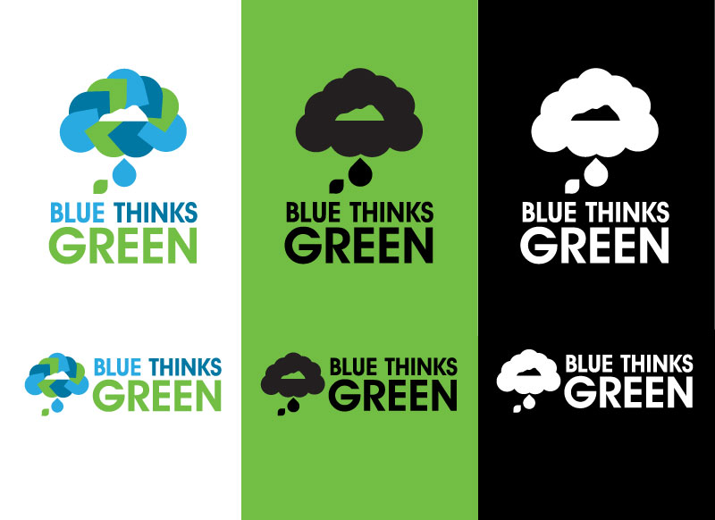
Both single colour and full colour logos we created in a stacked format and long. In order to give the brand the most usage and scale it is key to have these options for use.
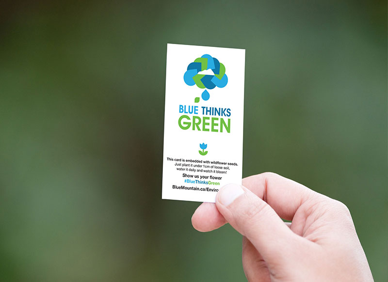
The full colour logo consists of two parts the logo symbol and the word mark. The word mark is pretty simple leveraging the internal brand font “ITC Avant Garde Demi” while the logo symbol is complex. The “brain” is to represent the think part of the identity can also be seen to represent a cloud or thought bubble. The three colours are represented three times in a triangle pattern to represent the “blue thinks green” words, the typical “reduce, reuse and recycle” and are all centered around the Mountain Logo. Even the thought dots are deliberate; water and leaf.
A simple idea brought to life.
- Company: Blue Mountain Resort
- Date: July 2019
- Category: Logo Design